Growing Into Non-Deterministic User Interfaces
07 Oct 2017I found myself scrolling through the Home section of the YouTube app the other day. I usually go straight to my subscriptions, but I happened to be running dry on subscription videos. So I decided to browse through what the YouTube algorithms had to recommend for me, and also through the trending list that day.
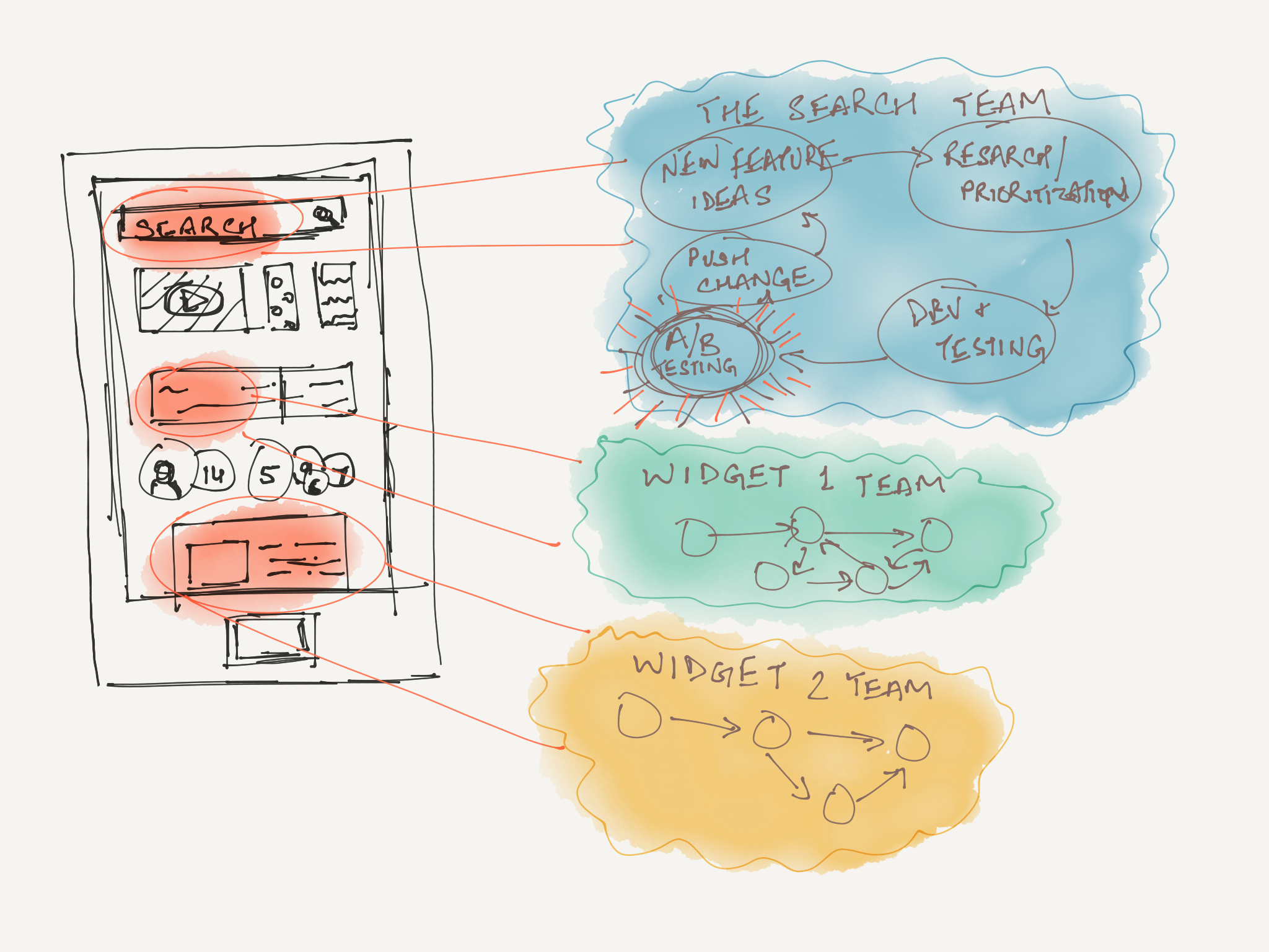
As I was scrolling through, I noticed a widget. It contained three video thumbnails from the same channel, placed horizontally, and it was labeled “Rising Creator”. I had never seen this widget before. I scrolled past it.
Everyone writes about how the web is growing up and becoming more personalized by the day. Targeted advertising is making everyone’s surfing experience tailored to them. Human-assisted learning algorithms are helping people decide which outfit works better on them. Music streaming services are sifting through record shelves and popularity charts, and not just surfacing vague recommendations, but confidently curating them into playlists.
Amidst the slowly maturing algorithmically customized dynamic experiences, Internet services are seeing another, more subtle shift. One which has to do with the way these experiences are iterated upon.
We are stepping into the world of constantly evolving, and therefore unpredictable user experiences.
Huh?
Think of a popular online service that you use that is developed by a recently founded (~5 years) startup. Now think about the various design and branding changes they have made over time. If you were an early adopter of Snapchat, think about the evolution of the Stories screen.
That’s the kind of trend I’m getting at.
As I see it, this trend is a side effect of a few other trends that we’ve been seeing lately.
- Algorithmically customized experiences: As we get better at predicting what users want on the fly, we build user interfaces that can mold themselves to fit these predictions. Consider the YouTube example from the top of this article as an example. It’s a proactive UI element that appears when needed, instead of a permanent fixture somewhere that the user subconsciously learns to ignore.
- Continuous delivery: Developers have been moving toward continuous delivery/deployment systems in software development for a while now. Meaning they ship new code on fuzzy schedules. Consider about all the apps that you use that get updates every week. Notice how they often have unclear release notes. This is likely because automatic updates are turned on by default (users don’t see changelogs), and developers don’t have much reason to keep track of changes made in their workflows just to write meaningful changelogs.
- Experimental approaches to UX design: The commonplaceness of changes delivered through CD pipelines and automatic updates makes it viable for developers to run rolling A/B tests in apps. These tests allow for behavior-centric software development cycles. Software teams use these on a rolling basis to determine which bits of UI they need to iterate upon. It’s a pretty elegant feedback loop, really.

All this has culminated in a climate where users expect their online experiences to change over time. I’d say most people are at least comfortable with the idea at this point. Think back to the time when Facebook was in early stages. As the service scaled up, it would make sweeping design refreshes across the entire platform. In the last few years, however, we have barely seen any large scale renovations of this sort. As the company has grown, it has adopted the practice of continuously tweaking features separately, frequently and almost imperceptibly.
Navigating Blind With VUIs
One area where the effects of experimentation and rapid delivery are quite evident is the fledgling market of voice user interfaces (VUIs). Siri’s release in 2011 kicked off a Wild West of cloud-based personal voice assistants. Since then, we have seen various companies tackle the concept in various ways.
As these companies try to figure out what this new industry should really look like, we get a Wild West market of VUIs to choose from.
Alexa—the brain behind Echo—is built in the cloud, so it is always getting smarter.
- Echo product page on Amazon.com, 2017
There is a key difference between graphical interfaces and voice interfaces - users see the parts of GUIs that they never use.
Time for an activity! Pick up your smartphone and look at your home or lock screen where you keep your most used apps. You likely use some of those apps more frequently than others. Yet, every time you go to open one of them, you see neighboring apps. This way, you are aware of all the things your phone can do even if you don’t do those things all the time. Open the settings app. You may tweak a couple of those settings every now and then (wallpaper, for example), but if the OS gets a new layout for the rest of the settings, you will become aware of those changes when you see them in passing.
Voice interfaces are vastly different. Until you tell people what your VUI can do, they *will not figure out all of it. Users do not get reminded of the Alexa skills they have enabled and have ready to go every time they use Alexa for something else, say, finding music. It’s much easier to forget your enabled Alexa skills than the list of apps you have installed on your smartphone.
VUIs must be designed to be navigated blindly.
When a VUI gets updated on a rolling schedule, there is a whole new set of rules to follow. Replacing a GUI element is easy. Users immediately see the shiny new button and can get reacquainted easily. VUI users, however, are blind. They don’t see the replacement voice command the next time they navigate near that feature.
With this I come to the reason I wanted to write this article in the first place…
Making VUIs Non-Deterministic
I think most of us would like to have sci-fi style conversational digital assistants one day - like Tony Stark’s FRIDAY - that not only helps with day-to-day tasks but is also smart enough to recognize deeper complexities of human language such as context, subtext, humor, sarcasm, and complex intents and imperatives. Modern day digital assistants are clearly nowhere close to that.
Now consider this: Human interactions are not deterministic. When you wish your best friend a “good morning”, they don’t reply with the same cheery “good morning” in response every single day. Ask them to look up the weather while packing for a weekend camping trip, and they won’t respond in the same monotone weather information for the weekend. Instead, they will respond with an interpretation of weather data, in context of your camping trip.
On the other hand, today’s computer interactions are deterministic. It’s not hard to add randomness to modern graphical interfaces; instead, users don’t want their applications and websites to behave differently every day.
We have never had the need to figure out usable GUIs that are random and playful, so we didn’t. VUIs benefit from randomness. To achieve conversational AI someday, we need to build non-deterministic behavior. We need randomness to make a computer’s responses truly sound human.

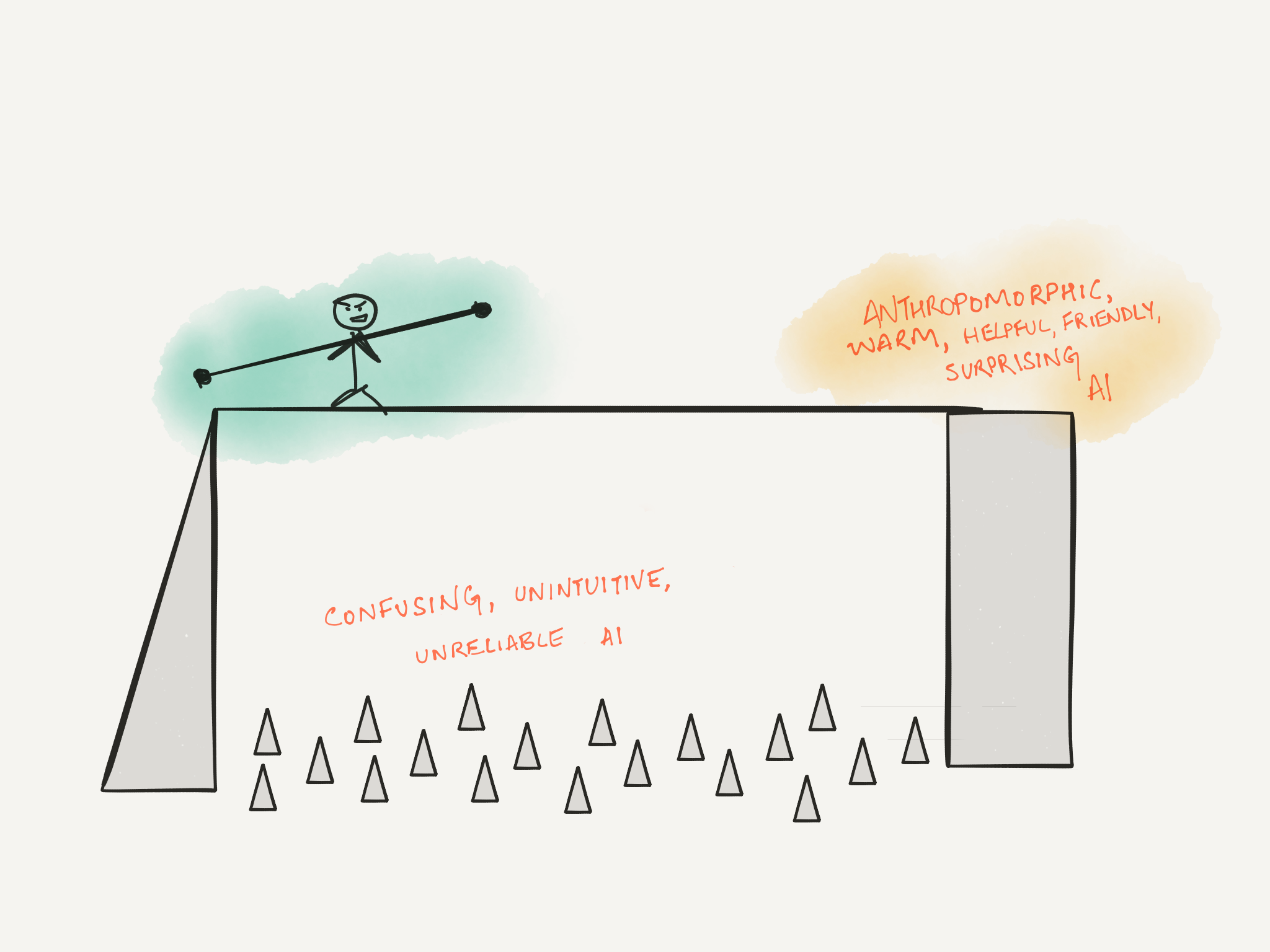
If you happen to be involved in product management for a digital assistant, keep this balancing act in mind as you move towards the inevitable non-deterministic assistant of the future.
A gradual shift without acknowledging these tradeoffs comes with the risk of confusing your current users along the way.
